Why https://ray.so Stands Out for Code Snippet Screenshots

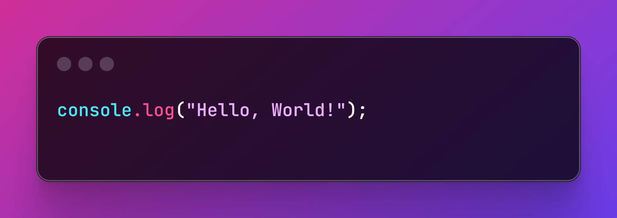
In the realm of developers and coders, sharing beautiful and professional-looking code snippets has become an essential part of communication. Whether it's for blog posts, presentations, or social media, tools like Ray.so and Carbon have gained popularity for transforming raw code into visually appealing screenshots. Among these, Ray.so has emerged as a favorite for many developers, including myself, due to its combination of aesthetics, simplicity, and utility.

What Makes Ray.so Exceptional?
1. Minimalistic Design and User Experience
One of the first things you'll notice about Ray.so is its clean and intuitive interface. It eliminates unnecessary distractions and allows you to focus on crafting the perfect code snippet. Compared to Carbon, Ray.so feels less cluttered and more modern.
2. Effortless Customization
Ray.so provides a range of customization options without overwhelming the user. You can:
- Choose from multiple themes to match your preferred style.
- Adjust the padding and font size for better readability.
- Enable or disable the background to suit your needs.
These features allow you to quickly produce a tailored snippet without spending too much time tweaking settings.
3. One-Click Sharing
Sharing your creations is a breeze with Ray.so. Once you've styled your snippet, you can easily download it or share it directly on social media platforms. This simplicity is a game-changer, especially when you're working under tight deadlines.
4. Better Default Aesthetics
While Carbon offers a wide variety of options, Ray.so shines with its default presets. Even with minimal adjustments, your code snippet looks polished and professional. This makes it an ideal choice for developers who prefer a "set it and forget it" approach.
Comparing with Carbon
Although Carbon remains a strong contender with its extensive feature set, Ray.so often wins when it comes to ease of use and visual appeal. Here's a quick comparison:
| Feature | Ray.so | Carbon |
|---|---|---|
| Interface Design | Minimalistic and modern | Feature-rich but can feel busy |
| Customization | Quick and simple | Extensive but time-consuming |
| Default Aesthetics | Highly polished | Requires more adjustments |
| Sharing Options | Effortless | Slightly more manual |
Other Tools You Might Have Missed
While Ray.so and Carbon dominate the space, there are other tools worth exploring:
- Known for its detailed customization options and collaboration features.
- Great for team projects and presentations.
- Codepng
- Focuses on creating PNG files with various design templates.
- A good option if you're looking for simplicity.
- A Visual Studio Code extension that generates beautiful images of code directly within your editor.
- Convenient for developers who work primarily in VS Code.
Why Ray.so Remains My Go-To Tool
After trying out several alternatives, I keep coming back to Ray.so because of its effortless workflow, stunning results, and intuitive design. Whether I need a quick snippet for a tweet or a detailed example for a blog post, Ray.so delivers every time.
For developers who value simplicity and aesthetics, Ray.so is a must-try. It might not have every feature under the sun, but it strikes the perfect balance between functionality and style, making it an indispensable tool in a coder's arsenal.


Comments ()